Using Food Service Reports to Optimize Your Operation
It goes without saying that food service operators everywhere are constantly seeking new ways to optimize efficiency, maximize budgets, and hit key performance indicators. To achieve these goals, leveraging data to analyze performance – and showcase it to C-level personnel – is crucial. For example, food service reports such as meal service history and cost of overproduction provide insight into areas of improvement and reallocation of resources.

Collecting data in a single location is the first step to capturing a comprehensive view of an operation via food service reports. Yet, even with abundant data generated and made available through integrated technologies, operators often find themselves asking, “How do I make sense of it all?”
Dashboard Analytics & Data Visualization
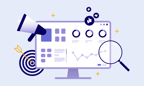
By utilizing visual elements such as dashboards, charts, and graphs, information becomes easier to interpret and actionable. Operators can identify patterns, pinpoint areas of improvement, and better depict their overall performance – all within a condensed, digestible, and visually captivating format.
While numbers provide transparency, visualizations are the vehicle in which they transform into a greater story that can influence change. Thus, extracting data from food service reports and creating visualizations that highlight critical points can help:
Improve understanding of complex information
Enhance awareness of operational activity
Produce accurate forecasting for future adaptability
Streamline processes related to the organization
Facts at Your Fingertips
Furthermore, loading visualizations into a dashboard helps staff analyze activity at a glance. Consider lunchtime at a hospital, which includes multiple aspects: meal ordering, food preparation, meal delivery, patient identification, and tray pick-up. With so many factors in play, it is vital to make data analytics as straightforward as possible. Displaying results in a shared space (e.g., on a TV screen in a kitchen) from food service reports like average tray delivery time can:
Generate real-time results
Support staff efficiency and agility during peak hours
Promote teamwork and staff morale by celebrating positive outcomes
Encourage healthy competition and provide coaching opportunities
Highlight department strengths and challenges for managers
In short, combining visualizations and dashboard analytics provides helpful insights to team members at every level of an organization. Most importantly, these tools ensure that food service reports are accessible and understandable to everyone, which in turn makes them useable for implementing constructive change.
Data Drives Success
With the key takeaways we’ve presented in this blog article, you are well-equipped to make data-driven decisions. If you are not already doing so, be sure to leverage the power of food service reports, data visualization tools, and dashboard analytics in your operations today. Don’t just guess – assess!
Related Posts
Ready to experience our software?
Get a Taste of our Foodservice Software!


